Category Archives: Landscape Architecture

Reimagining the Veterans Memorial Tunnels

Jon Altschuld is a landscape designer for THK Associates in Aurora, Colorado. THK developed the aesthetic design for the Veterans Memorial Tunnels, a major highway infrastructure project currently being constructed along Interstate 70 near Idaho Springs, CO. (If you’ve skied in Colorado, you’ve probably driven through this stretch of highway). We talked with Jon about how SketchUp was used in this project.

One of the final renderings of the proposed tunnel design – SketchUp model rendered with Vue.

Tell us a little more about this project.

These tunnels (formally known as the Twin Tunnels) were originally built in 1961. This project focused on improving mobility within the I-70 corridor by widening both tunnels to three lanes with wider shoulders. The project also focused on addressing safety and creating unique features to serve as gateways for the area.

The previous design of the tunnel portals created a feeling of driving into a headwall, which caused motorists to brake and slow down when approaching the tunnels. The new design resolves this problem by integrating a spiraling tunnel portal that welcomes motorists into the tunnel gradually. These spiraling tunnel portals are the result of evaluating multiple design options on a variety of criteria.

Did you work with any data that was imported into SketchUp? 

Yes, most of this 3D model was based on imported data. The existing terrain information was collected in the field with LiDAR, and the LiDAR data was converted into a TIN (Triangulated Irregular Network) mesh in Microstation. Microstation was used because that’s the main software the transportation engineers use. The Microstation mesh was then exported to AutoCAD .dwg files as both a mesh and as contour lines. We were able to import the mesh file directly into SketchUp, and the contour file was used to create proposed grading files in AutoCAD. The proposed grading files, as well as the plan view geometry (road layout, tunnel layout, retaining walls, etc.) were all created in AutoCAD and the .dwg files were imported into SketchUp. Once in SketchUp, the proposed contours became meshes via the From Contours Sandbox tool, and they were then combined with the existing grade meshes.

How did SketchUp help in the decision-making process? 

This project used a Context Sensitive Solutions (CSS) approach, which involves creating and evaluating a number of options based on a variety of criteria. SketchUp was used to arrive at the final options that were evaluated in the CSS process, and for evaluation during the actual CSS process. Leading up to CSS, over a dozen different design options were created and explored in meetings. For these meetings, SketchUp was more useful than final renderings because we were able to look at any view in real time, as well as make design changes to explore additional options. During the CSS evaluation, SketchUp was used to compare four options side-by-side.

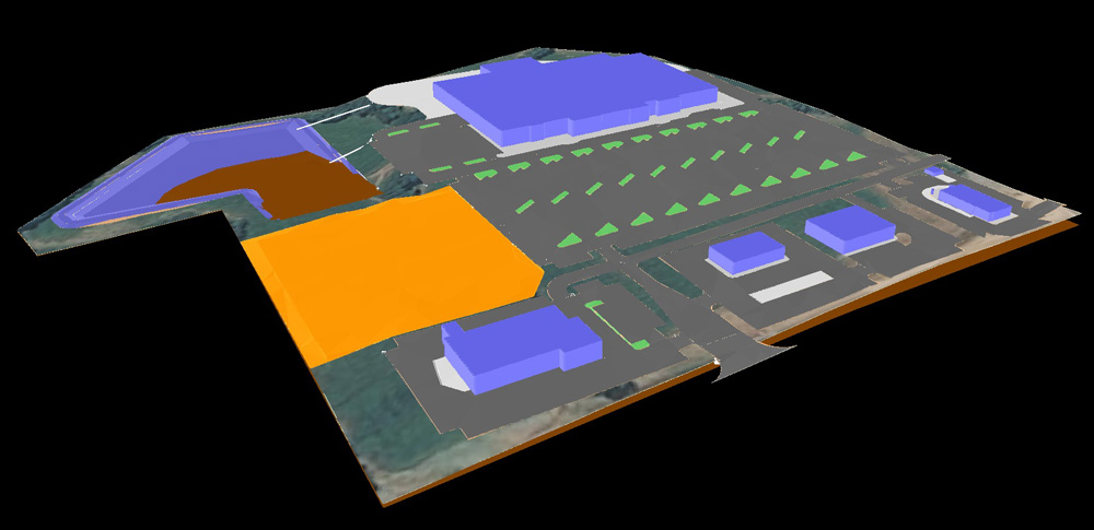
One of the west portal options in SketchUp. The pinkish area is existing terrain, and the purplish area is proposed (the big wall of purple is a large cut where rock was blasted away to create enough space for the wider tunnels).

How did you communicate or collaborate with other colleagues and consultants? 

We used one main SketchUp model with multiple groups and layers. I’m a bit of a grouping (and components) fanatic; it keeps models organized and the file size down. I mainly use layers for separating visual options, which was perfect for this project. One little trick was to place 3D text with the name of the design option in a visible place in the model (as seen in the image above) and put it on the same layer as the geometry for that layer. Whenever Option B was being shown, “Option B” text was visible; this helped reduce confusion.

I think the SketchUp images do a pretty good job of showing how we used SketchUp as a design tool, but what isn’t shown is how interactive it was for meetings. Being able to analyze and compare over a dozen options from any view, modify those options on the fly, and create new options while in meetings was invaluable. To work efficiently on the fly, the model needs to be created with that objective in mind. For example, having the different options on appropriately named layers allows you to quickly compare the options at the request of meeting attendees. Having the model neatly grouped allows you to easily modify pieces without affecting the whole model (be sure to know which pieces are groups and which are components). These in-meeting modifications to the model often are not as clean as the overall model and may require some clean up back at the office. Typically, I will save the ‘meeting’ version of the model, but only use it as a reference to make the refined edits to the final model.

Were there any SketchUp extensions that helped with this project? 

I use extensions every time I open SketchUp. Some that I use on almost every project – including this one – are Weld, Tools On Surface, Joint Push/Pull Interactive, Selection Toys, Bezier Spline, and PathCopy

The most challenging piece of the model to create was the spiraling tunnel extensions. I went through a number of trials to get the geometry correct; some of these trials used extensions such as Extrude Tools, Artisan, Curviloft, and Follow Me & Rotate. ThomThom recently released an extension called Bezier Surface that would have been really helpful had it been available when I was working on this model! 

Also, the ivy that is seen in the final Vue renderings was created in SketchUp using the SketchUp Ivy extension – this wasn’t added to the design until I was already working in Vue; that’s why the ivy doesn’t show up in the SketchUp images.

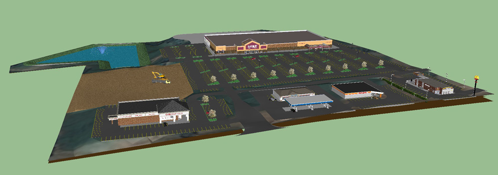
SketchUp view of the east portal exploring the spiraling hood extension at the tunnel entrance.

Tell us about the transition from SketchUp model to the final Vue renderings.

The transition from SketchUp to Vue is fairly simple. I typically change the SketchUp materials to bright solid colors so that I can easily differentiate them in Vue (unless there’s a SketchUp image texture I want to use in Vue). After cleaning up any unnecessary pieces of the model (such as unused options), I export the model to an .obj file and import that into Vue. All of the vegetation (except the ivy) is added in Vue. The boulders and talus slopes were also created in Vue. Vue recognizes objects based on material, so it is fairly easy to create and assign materials one-by-one for the model. The process typically involves a lot of quick, low quality test renders to fine tune the materials, lighting, camera, and atmospheric settings. Once these are all finalized, the high quality final renderings can be created – which can take a while. Some of the renderings for this project took 16+ hours to render! All that remains after that is post-processing work in Photoshop.

Final rendering of the east portal.

How do you go from SketchUp model to tunnel construction? 

For this project, much of the “base pieces” were already engineered and into construction documents when the SketchUp modeling began. For example, the core tunnel structure/bore, the roadway alignment, and the utilities were all pretty much set. The configuration of the tunnel extension walls, retaining walls, and proposed grading were all items that became defined by decisions from the SketchUp model. For these items, the beginnings of the construction documents were already in place from creating the linework in AutoCAD. From there, we simply had to bring these drawings to 100% construction documents and the General Contractor installed them. The General Contractor was involved in many meetings leading up to construction where we used the SketchUp model to better explain details of the design. 

Posted by Josh Reilly, SketchUp Team

Making custom patterns for LayOut

The major new feature in the newest version of LayOut in SketchUp Pro 2013 is Pattern Fill. It lets you fill any shape in your document with a pattern. LayOut ships with a library of patterns to get you started, but creating and adding your own is possible, too. This post is a tutorial on how to do just that.

The Basics

Patterns are made up of image tiles. When you assign a pattern to a shape, LayOut fills that shape with image tiles to create the pattern you want to see. The following picture shows this concept in action:

A sampling of patterns that ship with LayOut. Each is made up of image tiles which repeat to form the pattern.

There’s nothing magical about image tiles in LayOut; they’re just JPG, TIF, GIF or PNG images. All of the pattern tiles we’ve included with LayOut happen to be PNGs because that format supports non-lossy compression (which makes them look good) and alpha transparency (which makes parts of them see-through). If you can, you should make your pattern tiles PNGs, too.

To add a pattern to LayOut, all you have to do is choose Import Custom Pattern… from the drop-down menu in the Pattern Fill panel. You can choose any image you like; LayOut will automatically turn it into a pattern by tiling it (copying it in a grid).

How does LayOut decide how big to draw each individual tile in the pattern? It looks at the source image’s resolution (pixel density) and uses that. Every PNG, JPG, TIF, and other raster image is saved with a resolution when it’s created. This is expressed in pixels per inch, or ppi.

Consider an image which is 1200 pixels wide by 600 pixels high. If this image is saved at 300 ppi, its physical size would be 4 inches (1200 pixels ÷ 300 pixels per inch = 4 inches) by 2 inches . If it were saved at only 100 ppi, its physical size would be 12 inches (1200 px ÷ 100 ppi = 12 in) by 6 inches. The higher the resolution, the smaller the physical size.

Example: A simple geometric pattern

A pattern composed of parallelograms, or hexagons, or cubes, depending on how you look at it.

Let’s make a pattern that looks like the one in the image above. This pattern is relatively simple to create for three reasons:

1) It has only one basic unit.
The “cube” is repeated over and over; there is no other shape.

2) It isn’t trying to look “random”.
Patterns that are supposed to look like a random distribution of elements are much trickier to create. I’ll cover them in a separate article.

3) It has no horizontal or vertical lines at its edges.
The following procedure isn’t ideal for making pattern tiles that are made up of horizontal and vertical lines (like bricks and other rectilinear units). Those patterns, while common, are actually special cases that require a completely different technique to make sure they look right when they’re tiled together. You can see three examples of these in this article’s first image, above. I’ll outline that different technique in a separate article.

The technique that follows uses LayOut and Photoshop. While it’s possible to create pattern tiles using only LayOut (or even SketchUp, for that matter), Photoshop (or another image editor like GIMP) makes it much easier by providing pixel-level editing and tools for resizing raster images precisely.

Step 1: Use LayOut to manually draw a sample of the pattern.

LayOut is an obvious way to create simple pattern tiles like this one. The addition of SketchUp’s Copy Array feature to LayOut in SketchUp Pro 2013 makes tasks like this one a lot easier.

Step 1: Start by manually creating an area of pattern. For something this simple, LayOut works well.

Step 2: Outline a single tile with a rectangle.

Drawing this rectangle on a new layer makes it easier to turn on and off later on. Giving it a thick and brightly colored outline makes it easier to see what you’re doing.

Step 2: Use the Rectangle tool to outline a single tile.

Step 3: Fill the “tile outline” rectangle with a bright color and turn off its stroke.

This step makes it easy to crop away everything you don’t need once you’re in Photoshop. Choose a fill color that doesn’t appear anywhere in your pattern tile.

Step 3: Convert the outlined rectangle into a filled shape with no stroke.

Step 4: Duplicate the page and delete only the rectangle.

Step 4: Duplicate the page and remove the rectangle on the copy.

Step 5: Export a PDF.

In your exported PDF, include both the page with the rectangle and the one without.

Step 5: Export both pages as a PDF file.

Step 6: Open the PDF in Photoshop.

In Photoshop, choose to open both pages of the PDF as separate image files. Set the image size to something quite large, like 5000 pixels wide. You’ll downsample (make them smaller) later on.

Step 6: Open the pages of the PDF as separate Photoshop files

Step 7: Copy / Paste one file into the other.

In the open file with the colored rectangle, choose Select > All from the menu bar, then choose Edit > Copy. Move to the other open file, then choose Edit > Paste Special > Paste in Place to create a new layer.

Step 7: Copy/Paste in Place the contents of one file into the other, creating a new layer in the second file.

Step 8: Select the colored rectangle.

Choose the layer containing the colored rectangle, then activate the Magic Wand tool and click once on the rectangle to create a selection from it.

Step 8: Use the Magic Wand tool to select only the colored rectangle

Step 9: Crop the image based on the rectangular selection.

Choose Image > Crop from the menu bar to crop the file based on the selection rectangle. Choose Select > Deselect when you’re done.

Step 9: Crop the image, leaving only a single pattern tile

Step 10: Hide the layer containing the colored rectangle.

When you hide the layer with the colored rectangle on it, you should be left with only a single pattern tile in your Photoshop file. Save the layered image as a PSD file.

Step 10: Hide the layer containing the colored rectangle.

Step 11: Resize the file.

Choose Image > Image Size… to open the Image Size dialog box. Make sure the Resample Image checkbox is checked, and the drop-down menu below it is set to Bilinear. Type in a new width, in pixels, for your pattern tile, then click OK.

Note 1: If you create a very large pattern tile, you won’t ever have to worry about blurriness or visible pixels when your pattern appears in LayOut—it’ll be sharp as a tack. On the other hand, making your tile too large could bog down your computer; it all depends on how large each tile will appear, how many tiles LayOut will end up drawing, and how zippy your computer is.

Note 2: When it comes to digital images, there are some “magic” numbers to be aware of. They’re the powers of two (2, 4, 8, 16, 32, 64, 128, 256, 512, etc), and using them makes it easier for your computer to resample an image when it needs to be displayed bigger or smaller than its native size. Making your pattern tile image width one of these numbers says to the world, “I know what I’m doing.”

Step 11: Resize the image using the Image Size dialog box.

Step 12: Change the image resolution.

Choose Image > Image Size… to open the Image Size dialog box again. This time, make sure the Resample Image checkbox is unchecked. The fields in the Pixel Dimensions area of the window should be uneditable.

Here, you’re setting the physical size of the pattern tile on your page in LayOut. The value you type into the Width field is the physical width your tile will appear in LayOut when the pattern is set to 1x scale in the Pattern Fill panel. If you want an individual tile to be 0.5 inches wide in LayOut, enter that measurement into the Width field, and click OK.

Step 12: Change the image resolution (the pixel density) so that the pattern appears the correct size on your page in LayOut.

Step 13: Save your image as a PNG file.

As I explained at the top of this article, PNG is the image file format that offers both lossless file compression and support for areas of transparency. Both are desirable qualities in a pattern tile, so PNG’s almost always the way to go.

Step 13: Save the image tile as a PNG file. Giving it a meaningful name will save time in the long run.

Step 14: Import your custom pattern into LayOut.

Back in LayOut, open the Pattern Fill panel (Window > Pattern Fill) and choose Import Custom Pattern… from the drop-down menu at the top. Find the PNG file you created in Step 13 and open it.

To make your custom patterns available in every new LayOut document you create, put them in folders on your system and use the Add Custom Collection… option from the drop-down menu in the Pattern FIll panel.

Step 14: Use the Pattern Fill panel to import your custom pattern into LayOut.

In my next couple posts, I’ll outline techniques for creating pattern tiles that are rectilinear, ones that incorporate transparency, and ones that are supposed to look like a random distribution of elements. Stay tuned, and good luck.

Posted by Aidan Chopra, SketchUp Evangelist

A recap of SketchUp 3D Basecamp 2012

Almost two months ago, hundreds of the world’s most dedicated SketchUp aficionados descended upon our hometown for 3D Basecamp 2012. On the first day, we packed into the Boulder Theater for presentations from the SketchUp management team, several plugin developers and a keynote by Bre Pettis of MakerBot.

The first day of Basecamp took place at the historic Boulder Theater.

 
Leaders from SketchUp and Trimble talk about what’s in store for our product. They address such questions as “What’s next for SketchUp?” and “Why did Trimble buy SketchUp?”. (46:14)

 
The SketchUp leadership team takes questions from the 3D Basecamp audience. (17:06)

 
Representatives from seven SketchUp photo-realistic rendering plugins outline their product offerings in rapid succession. (17:07)

 
Four very different companies present their SketchUp-related technologies: BuildEdge, Sunglass, Product Connect and 4D Virtual Builder. (56:57)

 
 MakerBot Industries co-founder Bre Pettis delivers a terrific keynote presentation about 3D printing. (31:35)

That night, we gathered at a local spot for a party, where the highlight was undoubtedly the SketchUp ShootOut: two heroes competing to make the audience guess a mystery word by modeling on side-side computers. Bulldozer! Cabin! Bubble tea! Melancholy! The winning guesser and the winning modeler both won free drinks, but everyone seemed to be having a blast. Note: I beat John in a best-of-five match with “glove”, “foyer” and “cook”. It may be the proudest I’ve been all year.

Hotshot modelers squared off against each other in the first-ever SketchUp ShootOut.

Tuesday’s proceedings moved to yet another venue for a full day of barely-contained mayhem. The morning’s three blocks of unconference sessions coincided with three hours of beginner Ruby training. After lunch, we squeezed together to watch scheduled presentations by the likes of Daniel Tal, Nick Sonder, Mark Carvalho, and teams from 3skeng, ARmedia and SightSpace 3D. Three more hours of unconference sessions and a repeat of the morning’s Ruby 101 class followed, then everyone went straight to bed. I assume.

 
Landscape architect and author Daniel Tal presents a wide-ranging set of tips, tricks and best practices for modeling everything from terrain to site design. (40:31)

 
Architect and video tutorial star Nick Sonder outlines his process for using SketchUp Pro and LayOut to create complete sets of construction documents for his projects. Note: We subsequently made a set of six videos with Nick that describe his process in detail. They’re easier to watch and understand than this recording—just an FYI. (52:06)

We planned a Design Charrette for Day 3; participants split up into teams to tackle a challenge that we created in collaboration with Impact on Education, a local non-profit that acts as a kind of R&D department for the Boulder Valley School District. The design brief involved re-imagining a classroom to take into account the way teaching and learning have evolved with the introduction of mobile technology. At the end of the two-and-a-half hour charrette, a dozen teams presented their designs (in SketchUp and LayOut, of course), after which an illustrious panel of judges from IoE picked their favorite projects. The winning team members then squared off against each other for several rounds of SketchUp trivia. The victorious Michaels (Tadros and Brightman) each won a Replicator 3D printer, generously donated by our friends at MakerBot Industries.

While the designer-types did their thing, about twenty plugin authors spent Day 3 across the street at our first-ever Ruby Developers’ Conference. They huddled and schemed and plotted the future of our API (application programming interface). They even held a competition of their own: Dale Martens, a.k.a. “Whaat” and the creator of the Artisan organic modeling tool set, won the hackathon by coding a working first-person shooter game that runs inside SketchUp—in a couple of hours. Needless to say, Dale got a MakerBot, too.

Participants in Wednesday’s Ruby Developer Conference posing as if they’re a sports team.

All in all, we’re pretty proud of how well our first Basecamp at Trimble went, considering how quickly we planned it and that Dusty (our Event Manager extraordinaire) isn’t on the SketchUp team anymore. The space was at times tight and A/V and internet access are forever thorns in my side, but the vast majority of attendees we surveyed said they enjoyed themselves, learned some things, met cool people and (most tellingly) would happily join us at another 3D Basecamp.

Which brings me to my last point: When’s the next Basecamp? Good question. We don’t know right now, but given that our plan is to move to an annual release cycle starting next year, and that conferences are a great way to celebrate product launches, we’ll do our best to make sure there’s a 3D Basecamp in 2013. If you’d like to be one of the first to know when we announce it, you can add your name to our Next Basecamp Notification List.

Feel like looking at lots of pictures from the event? This album should do the trick.

Posted by Aidan Chopra, SketchUp Evangelist

Creating complete construction docs in LayOut

When we profiled architect Nick Sonders’ amazing use of LayOut to create full sets of construction documents for his houses, we knew we were on to something big. The deluge of “TELL ME IMMEDIATELY HOW HE DID THAT” sentiment that ensued prompted us to follow up in two ways:

We invited Nick to present his workflow at our 3D Basecamp event last month. The house was packed and Nick was great, but the audio in the video recording was a little rough, so…

Our videograhper Tyson traveled to Truckee, California to record an in-depth series of videos that document Nick’s process in delectable detail.

Half tutorial, half motivational speech and half religious experience (for SketchUp people, at least), the “Sonder Series” is 150% better than anything else we’ve created for aspiring LayOut users. If you believe in your heart that your SketchUp models deserve to live on, that CAD drafting separate 2D orthographic views is a terrible way to spend your evenings, and that there has to be a better way, this is your path forward. Pop some corn and kick back for some serious edification.

The first video is below; the other five are on online when you’re ready.

Posted by Aidan Chopra, SketchUp Evangelist

3DOn ARchitecture: Augmented Reality for iOS devices

Paul from 3DOn Ltd. presented at an event I attended a month or so ago. After his presentation, I asked him if we could tell the SketchUp community about his product, 3DOn ARchitecture. He said yes, but at the time the app was only available in the UK. Now it’s available to SketchUp users all over the world. Hooray!

3DOn ARchitecture is an augmented reality app for architects. It allows you to upload your SketchUp models and view them on an iPhone or an iPad in three different modes. Preview mode lets you overlay your model onto a photograph of your site. Walk mode lets you explore your model inside and out, and On-site mode lets you view your model in situ—in real time.

3DOn ARchitecture can be downloaded for iPhone (3GS or later) or iPad. For more information, you can visit the 3DOn website or follow the 3DOn team on Twitter.

SITEOPS: Conceptual design for land development

Back in architecture school, I once had to lay out a parking lot for a building I was designing. What a terrible, terrible exercise in nitpicky details and perpetual re-arrangement. The solution I came up with accommodated all of four Smart cars and a unicycle. Awful. If only I’d had access to a tool like SITEOPS from BLUERIDGE Analytics.

SITEOPS is conceptual land development software for folks like architects, civil engineers, landscape architects and land developers. After you’ve brought in a site, you can combine building footprints with critical elements like parking, islands and driveways. These elements are parametric, meaning that they re-draw themselves on the fly as you change aspects of your conceptual design. SITEOPS even provides budget tools for estimating the cost of a project.

Want to see what a parking layout might look like if your building were on the other side of the site? As you slide it over, the parking lot automatically reconfigures to maintain the proper number of spaces. Too cool. This short video shows SITEOPS it in action:

Realizing that lots of their users are also SketchUp devotees, the good people at BLUERIDGE have added an Export to SketchUp button to their product. It lets you figure out the complicated stuff in SITEOPS, then visualize your project in SketchUp. It’s available to SITEOPS customers who have also purchased the Grading and Piping Module. These pictures tell the story better than words can:

This is a view of a 2D site layout in SITEOPS.

A 3D image of the same site in SITEOPS’ Grading and Piping Module.

The site after it’s been exported to SketchUp. The model includes all of the 3D topographical information from SITEOPS.

Here’s a video that features a couple of SketchUp users talking about their impressions of SITEOPS’ new SketchUp integration:

Update: The folks at BLUERIDGE Analytics are offering a free webinar about using SITEOPS with SketchUp Pro. It’s scheduled for 2:00 PM EST on Wednesday, January 11th, 2012. Sign up if you’re interested—the webinar also carries 1 PDH or 1 LU.

Introducing Maxwell for Google SketchUp

Among rendering die-hards, the name “Maxwell” has long been synonymous with jaw-dropping realism. Maxwell Render’s makers have offered a SketchUp-to-Maxwell solution for a few years, but it required modelers to have access to Maxwell Render Suite—the full, standalone version. For SketchUppers on a budget (or who only need to make the occasional rendering), this wasn’t an ideal arrangement.

A delicious Maxwell render by Rune Skjøldberg.

To accommodate more people, the folks behind Maxwell have just released something they’re calling Maxwell for Google SketchUp. It’s a dedicated photo-renderer, based on the venerable Maxwell rendering engine, that operates entirely inside of SketchUp. Best of all, it has the Big Three qualities going for it:

  • Cross-platform. It works on both Windows and Mac systems.
  • For both free and Pro. It works on both SketchUp and SketchUp Pro.
  • Two entry points. There are free and licensed versions available.

As you can see in this straightforward feature matrix, the free version allows you to render in Draft mode and limits your resulting image to a resolution of 800 pixels. The Licensed version adds Production mode (faster rendering of complex lighting) and increases your maximum output resolution to 1920 pixels. At only $95/75€, the paid version is a bit of a bargain.

Another render by Rune Skjøldberg showcasing multiple light sources.

If you’re looking for all the bells and whistles and extra pixels that Render Suite offers, the “bridge” plugin for sending your SketchUp model to R.S is still available. So really, SketchUp modelers who want Maxwell’s delicious, unbiased results have three options. And they’re all good ones.

Posted by Aidan Chopra, SketchUp Evangelist

How do you make ideas real with SketchUp?

Every week, two million people use SketchUp to breathe life into their ideas. The resulting 3D models get made into houses and schools, movie sets and aquariums, bridges, robots, and furniture. The sum total of all this work represents a larger, yet untold story of how the SketchUp community is profoundly shaping the world around us.

Well, it’s time for all you unsung SketchUp heroes to stand up and take a bow, so today, we’re kicking off the Make Ideas Real project. The result of this initiative will be an innovative, online showcase that does justice to the impact SketchUp users are having on the physical world.

But we need your help to pull this off.
Make Ideas Real with SketchUp

Here’s how you can pitch in: Use this form to tell us your SketchUp story. Send us an image of a SketchUp model with an accompanying photograph that shows your completed project. Anything goes for subject matter; architecture, archeology, industrial design, construction, woodworking, personal fabrication, model railroading, mousetrap design — as long as SketchUp helped you make it, we want to see it. Professionals, semi-professionals and proud amateurs are all welcome.

Here are three examples of what we mean:

City Lights Residence, Steve Oles

SKPR Bot, John Bacus

Stand Up Desk, Dave Richards and George LaRue Downing

Over the next few months, we’ll curate the submissions we receive, and in 2012, we’ll launch a special showcase of SketchUp users who are reimagining the spaces we inhabit. Please share your story with us, so we can share it with the world.

Posted by Gopal Shah, SketchUp team

Speed Up SketchUp: Use Fast Styles

You might not realize that the display settings you choose to apply to your models can affect SketchUp’s speed and general responsiveness. Turning on fancy edge effects and other doodads will slow you down when your model gets big.

When you’re working on a big model, you want to make sure that you’re using a style whose Edge Settings panel looks like the one in the image below. Everything but “Edges” should be turned off.

The Face Settings panel is where you can choose not to display Transparency. When Transparency is turned on, SketchUp has to redraw your model on the screen several times—each time you change your viewpoint. If you don’t need to see through your windows just now, opt to temporarily view these faces without transparency.

The Background Settings panel is handy for turning off Sky and Ground, both of which cause your computer to do extra thinking while you’re working.

Unless you absolutely need them, you should use the checkbox in the Watermark Settings panel to turn off Watermarks.

The only toggles in the Modeling Settings panel you really need to worry about are the ones for Hidden Geometry and Section Planes. Obviously, you shouldn’t have wither of these displayed if speed is what you’re aiming for.


Once you’ve configured your own fast style, you should save it. Just give it a new name (I suggest “Fast Style”), hit Enter, and click the Create New Style button in the Styles Browser. You new style is saved in the “In Model” collection of styles, which is only associated with the model you’re currently working on.

Incidentally, almost all of the choices in SketchUp’s Default Styles collection are so-called “Fast styles” — their Edge Display settings are already configured for speed. Choosing any one of these styles will switch off extraneous effects.

Make a Fast Scene

True SketchUp whizzes invariably go one step further and add a special “Fast” scene that they can activate whenever they need to. Rather than having to mess with the Styles Browser every time they want to activate their Fast Style, they just click a scene tab at the top of the modeling window. This Fast scene is usually set up to do three things: Switch to a Fast style, turn off Shadows, and turn off Fog.

Follow these steps to add a Fast scene to your model:

  1. Apply a Fast style to your model by choosing it from the Style Browser’s Select tab.
  2. Make sure Shadows and Fog are both turned off. These toggles are in the View menu.
  3. Choose Window > Scenes to open the Scenes Manager.
  4. Expand the Scenes Manager by clicking the Show Details button in the upper right corner.
  5. Click the Add Scene button to add a new scene to your model.
  6. Rename your new scene “Fast” (or something similarly descriptive) and hit Enter on your keyboard.
  7. Make sure that only the “Style and Fog” and “Shadow Settings” checkboxes are selected in the Properties to Save section of the Scenes Manager.

From now on, all you have to do is click the “Fast” scene tab when you want to improve SketchUp’s performance. Instant productivity boost!